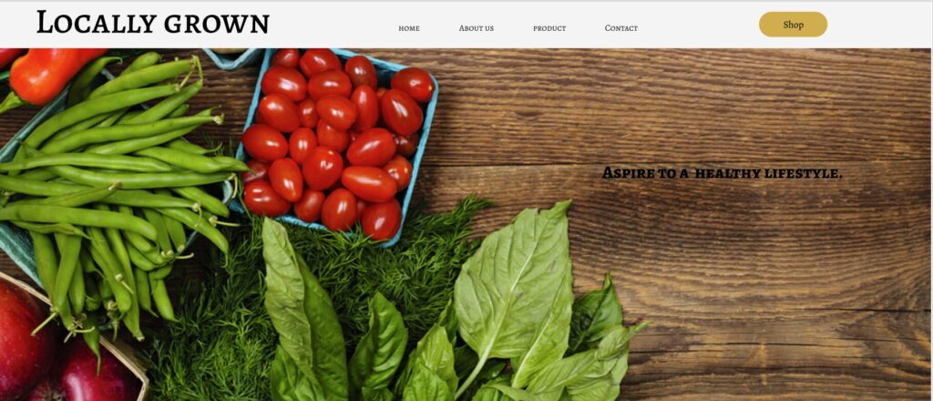
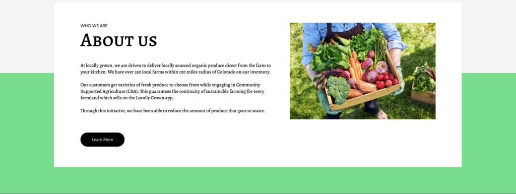
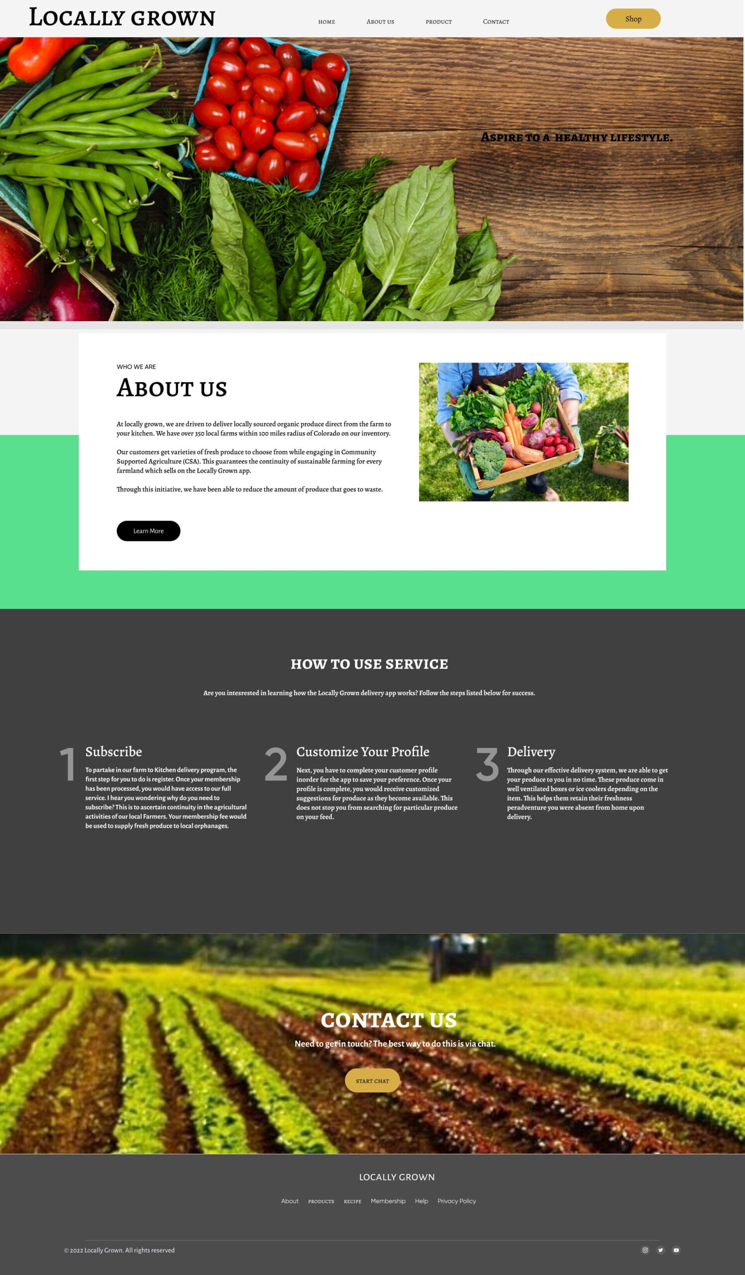
The title for the About page is relatively straightforward and self-explanatory. I guided the readers to focus on what Locally Grown as a brand does, then I went on to explain how the initiative benefits its vendors and the users. To foster a sense of belonging and identity with the Locally Grown brand, more light was shed on the Corporate Social Responsibility (CSR) project aspect of Locally Grown. I also went ahead to include a ’Learn More’ button which can contain content stories of how the project was birthed, the Community Supported Agriculture (CSA) aspect of the project, how Locally Grown gives back to the community, and information about the team. This way the readers would better know the product and its management.
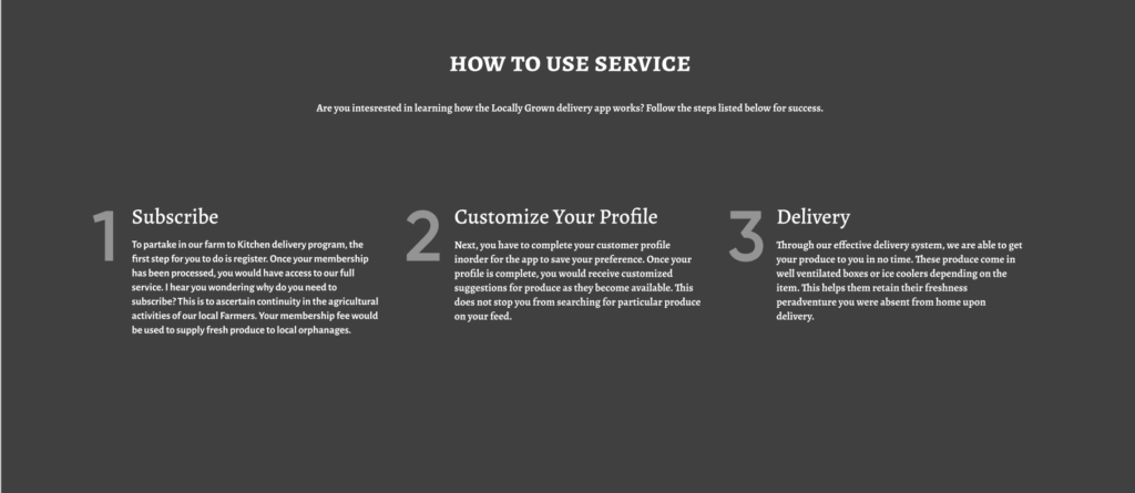
I took the reader’s attention with the font of each number and each subheading. They were aligned in a synchronous manner for them to be easily noticed and committed to heart from a glance.
Number one (subscribe) focused on registering for membership to partake in the Locally Grown lifestyle. I went further to interject a friendly and laid-back tone to my content like the reader is a friend sitting across from Locally Grown. This was made evident in my writing, anticipating the reader’s thoughts which is ‘Why should i subscribe?’ This question was answered by mentioning the purpose of their subscription which ensures stability for the farmers while giving back to society.
Number two (customize your profile) explains what they are to expect from their first interactions with the app after their membership subscription. I believe this step was necessary to eliminate the guesswork which comes with new usage and also save the user’s time. This way another UX Content strategy has been achieved which involves the customer not thinking or stressing about the app since it can be helped. Number three (delivery) goes through the delivery packaging which was explained by citing different scenarios and conditions of the farm produce as at delivery.
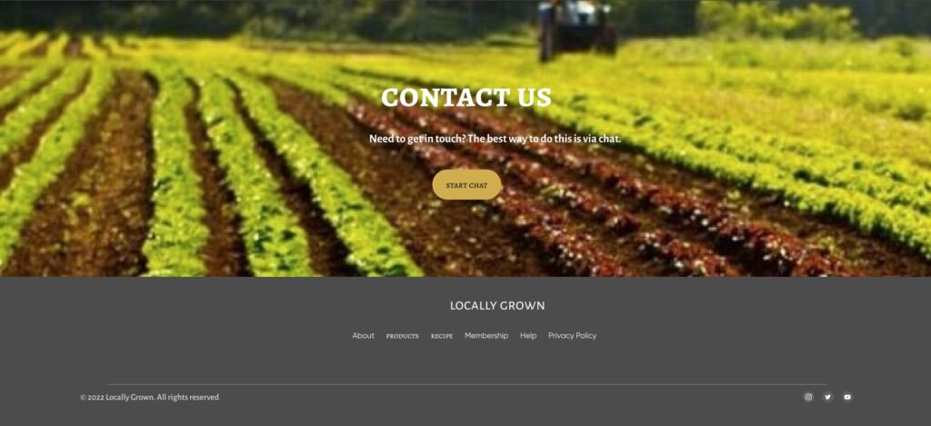
Kingston in his writeup on ‘Key Principles of Visual Hierarchy in UX Design’ made me understand what visual hierarchy can help achieve in UX writing. “Content helps to fill a page, but the visual hierarchy places elements on a page in the correct place and ensures the most important elements stand out by considering aspects such as contrast, scale, balance, scanning patterns, etc. (Kingston 2020). With this information in mind, I harnessed the scanning pattern of users which is mostly from the top left corner of a page to the right then down to the center and back to the bottom left to right to achieve a Z-shaped pattern.
I placed the logo for Locally Grown on the top left alongside the menu options. A picture of some farm produce that looks fresh and enticing is on display as the background of the homepage.
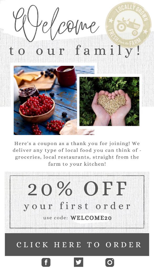
The Rationale for Welcome Email
Locally Grown’s core values are to create a sense of community and belonging, which is why each new subscriber is welcomed in as a family member. Through its values-based strategy Locally Grown hopes to increase engagement and to build brand loyalty.
To align with Locally Growns’ goal of building a community, the word “family” was chosen. This word choice personalizes the welcome email experience while keeping the first sentence concise. This is continued into the body of the email which is usually read by consumers in less than 10 seconds (Kilens 2014). The paragraph which follows helps the audience have a better sense of what Locally Grown has to offer. This brief introduction plays an important role in whether or not the consumer will decide to place their first order with Locally Grown. This is the reason the tone of voice is simple, friendly and clear to win the audience over. While the copy of the email is important, the other design elements also play a strong role in the consumer’s impression of Locally Grown.
Simple design elements were used to capture the holistic nature of the company’s brand through earthy and organic colors. This is the reason photos and text were arranged in a way that makes use of the white space.
